Who the U2 is for
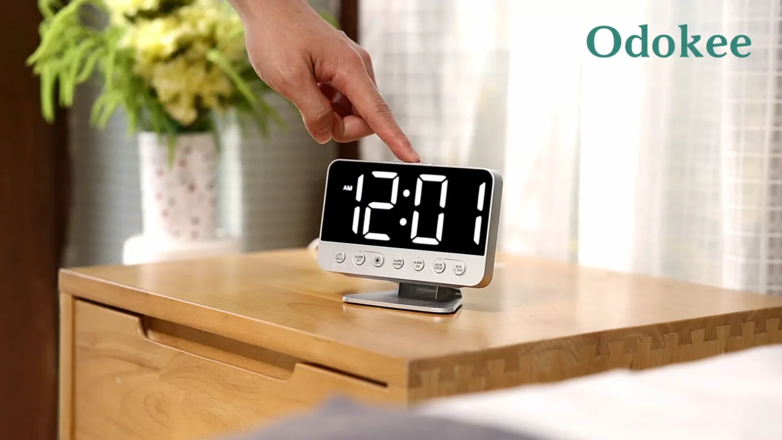
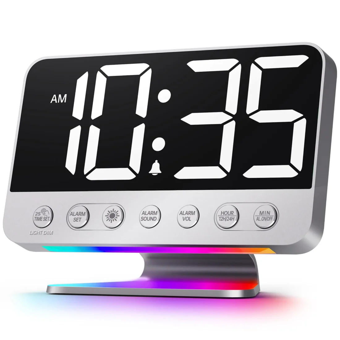
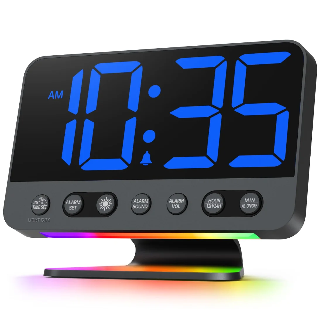
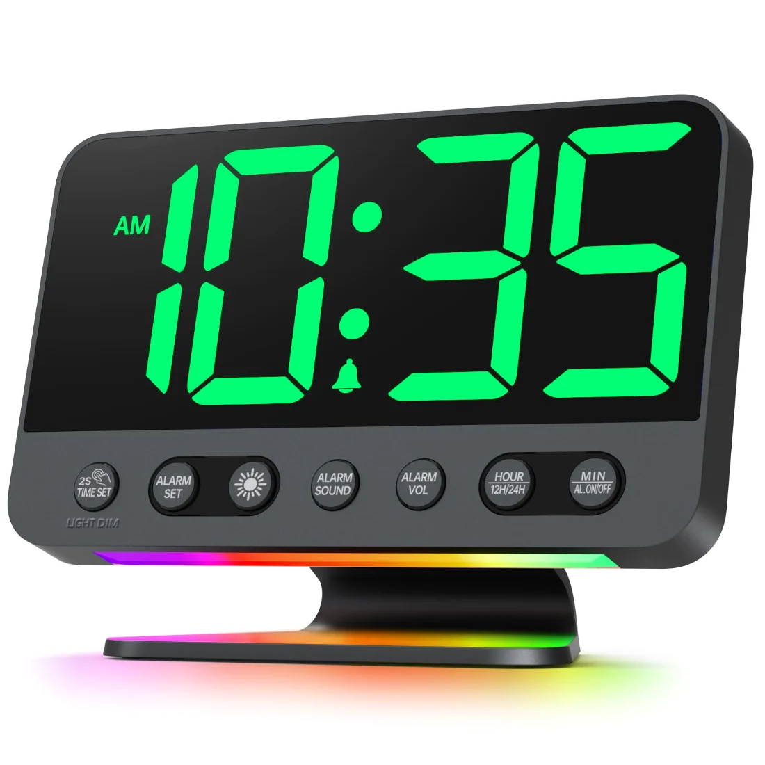
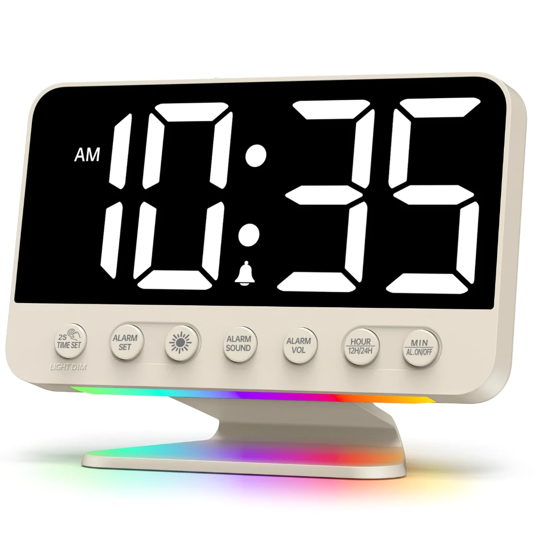
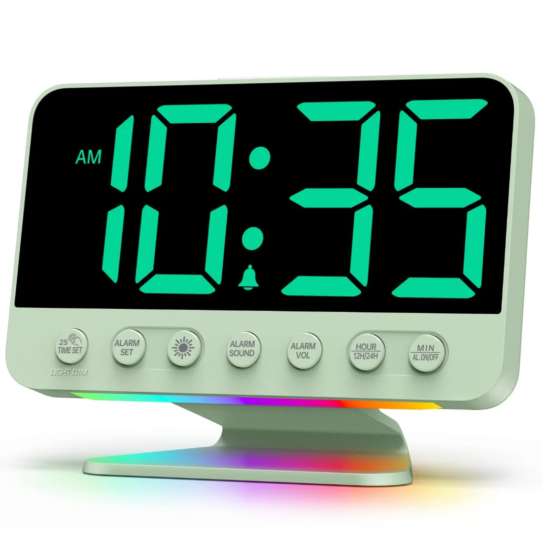
This line started with a single sentence, repeated in dozens of messages: I cannot read my clock any more. Not in the dark, not without glasses, not from the other side of the bed. The answer was not a brighter display, since brighter is what keeps people awake, but a bigger one. The U2 runs its numerals at two inches, which reads cleanly at three to four metres, and pairs them with five brightness steps so the size does not become a problem after midnight.
The other half of the design is the button layout. Every control sits on the front face, labelled, in a single row. Nothing has to be found by feeling along an edge in the dark, which is the failure mode of almost every clock with buttons on top.
What is in the box
The clock, the AC adapter and the instructions. Two AAA cells for the backup are not included and are not meant for daily running: they keep the time and the alarm alive through a power cut, and the display stays dark on purpose so the cells last. There is a USB port on the back for a phone.
Choosing a colour
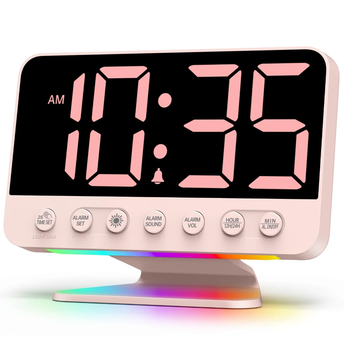
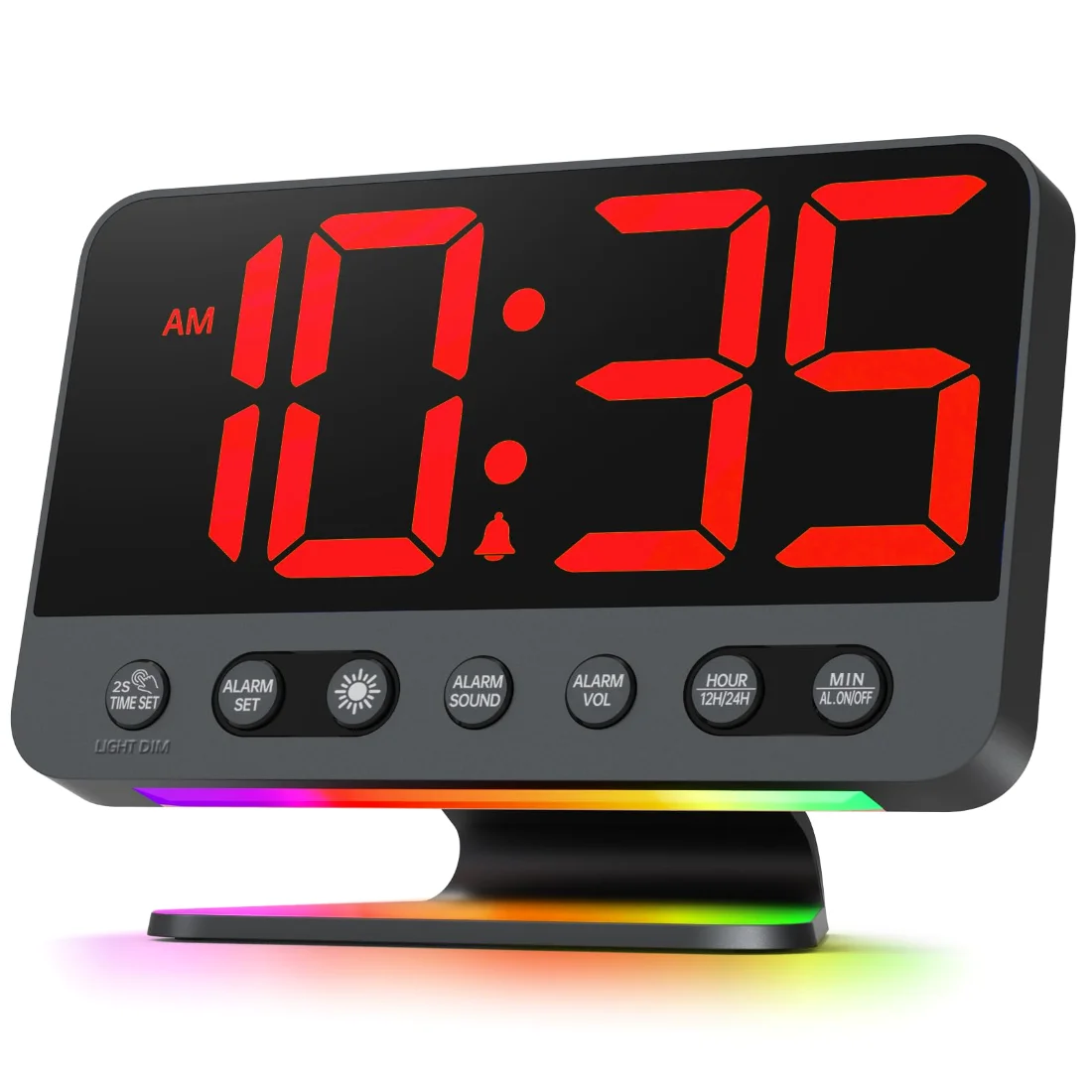
The shell colour and the digit colour are chosen together, and they matter for different reasons. The shell is a daytime decision; the digits are a night-time one. Red and green read lowest on a dark-adapted eye, white reads highest and is the easiest at distance, and blue sits in between. If the clock is for a child’s room, the sakura pink is the gentlest thing we make. All seven are the same machine.
The U2 is the largest display we build, and the only one where the numeral size is the reason to buy it. It sits alongside four other lines on the front page of the Odokee range, and the guide to laying out a nightstand works out which of them belongs on yours.